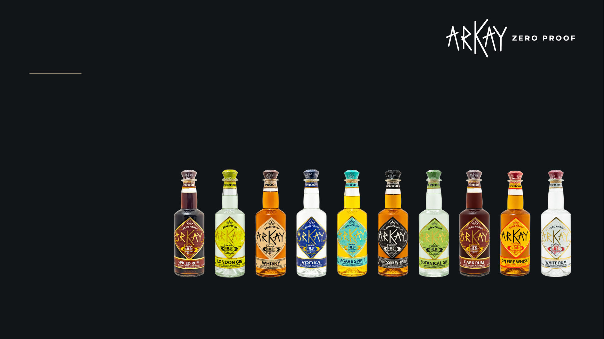
Brand / Visuals
Identity, product presentation and visual guardrails.
global core / local execution
0 1
operating principle
Use the master for truth. Use this book for speed.
A short visual system for creative, design, social, retail and agency teams.
fixed
Protect recognition
• Original approved logo artwork
• Seven exact digital HEX colors
• Merriweather Bold 700 for website headings
• Current product identity + approved wording
recommended
Keep it disciplined
• White for product clarity
• Near black for structure
• Gold for emphasis
• Greys for interface rhythm
flexible
Adapt the expression
• Editorial layout + responsive spacing
• Campaign scene, occasion + recipe context
• Image crop + placement inside approved layouts
• Channel-specific creative treatment
brand / visuals
quick reference
2
identity essentials
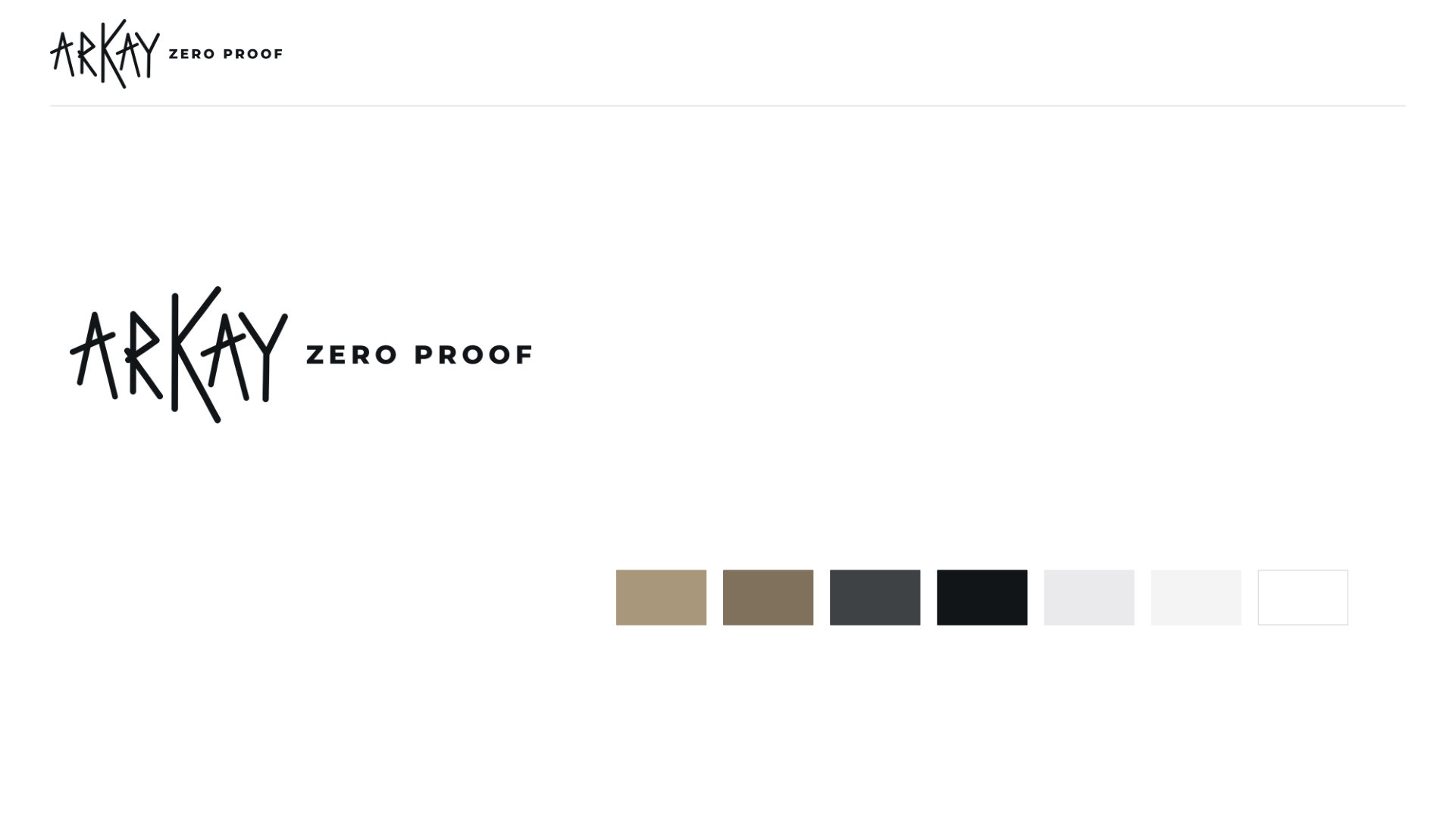
Logo, type + digital color
Use approved artwork. Never redraw the name or build a substitute mark.
logo
Clear space: ¼ of full logo height
Provisional digital minimum: 160 px horizontal / 80 px solid mark
No stretching, typed substitutes, cropping or low-contrast placement.
website type system
Merriweather Bold 700
H1 40 px • H2 35 • H3 30 • H4 25 • H5 20 • H6 16
Hero exception: 60 px desktop / 50 px tablet
Body: native system stack at 16 px
Button text: 15 px / square corners
Brand Gold
Dark Gold
Text Grey
Near Black
Light Grey
Lighter Grey
White
Product colors remain product-specific. Gold should organize emphasis, not dominate every element.
brand / visuals
quick reference
3
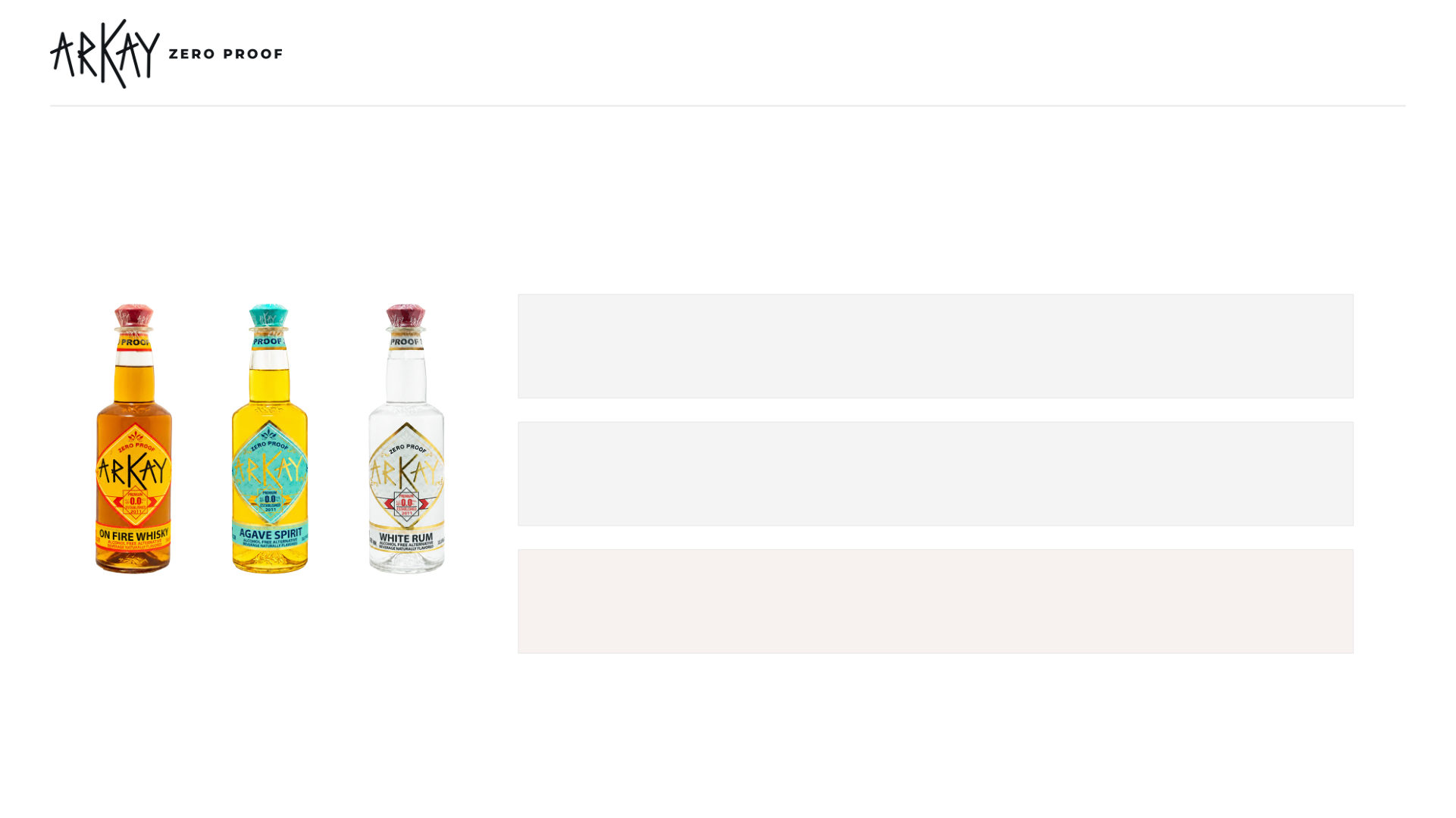
photography direction
Product first. Occasion second. Claims never implied by styling.
Current pack artwork and truthful product color always take priority over aesthetics.
product
lifestyle
Adult, natural, inclusive and credible. Show a real occasion and an achievable serve. People belong in the occasion, not in a claim.
do not
Generate substitute labels, recolor products, infer endorsements, or use styling that implies unsupported health or performance claims.
brand / visuals
quick reference
4
Use exact approved bottle or can artwork. Preserve product and label color. Current RTD format: 355 ml cans, in packs of 12.
channel + market expression
One identity. Different expressions.
Keep the recognizable core intact while adapting commercial details by channel and market.
ecommerce
Clarity first
• Exact product name + format
• Strong contrast + useful buying information
• Conversion may flex inside brand guardrails
social + film
Show the serve
• Let setting, pace + occasion change by platform
• Protect label, category context + product facts
• Use creators without implying unsupported claims
retail + trade
Teach the category
• Spirit-style navigation
• Precise descriptors
• Achievable serves
• Shelf, menu + staff education should feel like one system
global core
Logo artwork • master digital colors • tone principles • photography logic •
product truth
market layer
Legal descriptor + language • units + currency • approved local claims • price, tax, shipping, returns + support
brand / visuals
quick reference
5
• Clean bottle + can photography
• Keep bottles and cans identifiable
release in one minute
Quick reference
The fastest check before creative or production goes live.
D O
Use the system
• Use approved logo files
• Use exact digital HEX values
• Adapt scene, crop + layout
• Keep adult occasion credible
do not
Avoid shortcuts
• Redraw or stretch the logo
• Create a second decorative palette
• Generate substitute labels
• Hide product truth in styling
• Use guilt, recovery or medical cues
separate approval
Escalate first
• New logo variants or partner lockups
• Print inks, foil + substrates
• Claims, certifications + commercial offers
• Exceptions to digital type hierarchy
• Endorsements or permanent affiliations
brand / visuals
quick reference
6
• Show exact current bottle + can art